Detailed Comparison of iPhone 15 Pro Max Cutfiles | Why choose VecRas?
We will assess visual appeal, precision, user-friendliness, fit, and additional features/resources.
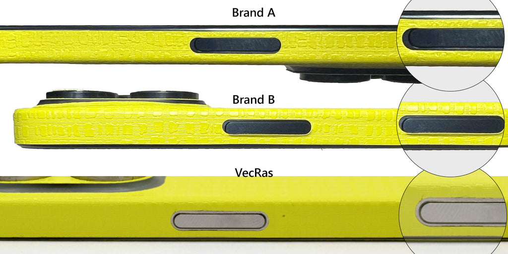
Power Button
Brand A: Imperfectly rounded shapes and uneven space around the button. Irregularly shaped buttons with irregular spacing.Brand B: Due to incorrect sizing, shaping, and positioning, the skin overlapped with the button, resulting in peeling issues with regular phone use.
VecRas: Flawless placement of the shape without any accessibility issues.

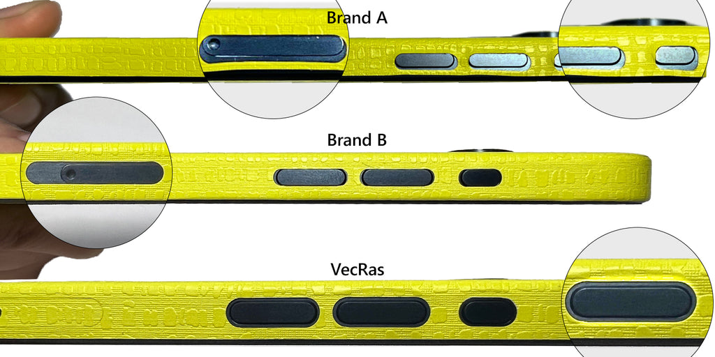
Sim Tray & Volume Buttons
Brand A: The shapes showed imperfections, appearing disproportionately large on one side, which resulted in uncovered areas and an unattractive aesthetic. Additionally, there was no designated shape provided for the SIM tray.
Brand B: The height of the volume button shapes did not correspond to the width, resulting in an uneven appearance. Furthermore, a critical issue was the misplacement of the SIM tray by 4-5mm below, rendering it inaccessible.
VecRas: All button shapes displayed flawless symmetry, creating a factory-fitted look with consistent spacing. We've included an extra figure for the SIM Tray, offering customization to suit individual preferences.

Speaker Holes & Corner Flaps
Brand A: The top and bottom shapes had inaccurate size, causing an excessive vinyl overhang beyond the phone's edges, and the corner flaps extended by 2-3mm, leading to overlaps with other shapes. These issues create a risk of the skin peeling off within hours of use, resulting in an unprofessional finish that leaves customers dissatisfied. Furthermore, the speaker holes were larger than necessary, substantially affecting the overall appearance.
Brand B: The upper corner flaps were slightly narrower, resulting in exposed areas along the phone's edges, whereas the lower flaps overlapped with the central shape. Additionally, the speaker holes and charging port shapes were not perfectly circular, and their positioning needed to be more accurate.
VecRas: All corner flaps were meticulously designed with even dimensions, ensuring no overlap or shortage. The speaker, screw holes, and charging port shapes fit perfectly without requiring manual adjustments, and the spacing was well-maintained.

CutFile Comparison:
We've overlaid all three cutfiles to provide a visual comparison. Please refer to the image below for a clear distinction between perfection and imperfection, denoted by color coding:- Brand A: Purple
- Brand B: Red
- VecRas: Green

Supporting Resources
VecRas: Understanding your needs, we provide comprehensive guidance and resources. You will find skin test images/videos on every product page. We've appropriately labelled the shapes, ensuring a straightforward and enjoyable workflow for everyone, including those new to the craft. You will get matching Realistic PSD Mockups and 4K How-To Apply Videos for listings.
Other Suppliers: Templates from alternative suppliers don't offer anything like that. They lack all of the followings:
- Skin Coverage Test Photos
- Different Cut/Logo styles
- Mockup PSDs
- Dimensions for each variant
- 4K Skin Pasting Tutorials
- Knowledgeable Blog Articles


Leave a comment